reading-notes
Flexbox and Templating
Javascript Templating Language and Engine— Mustache.js with Node and Express
-
Javascript Templating is a fast and efficient technique to render client-side view templates with Javascript by using a JSON data source.
-
Mustache is a logic-less template syntax (there are no if statements, else clauses, or for loops. Instead, there are only tags).
Mustache.render(“Hello, ”, { name: “Sherlynn” });
// returns: Hello, Sherlynn
Mustache is NOT a templating engine. Mustache is a specification for a templating language.
-
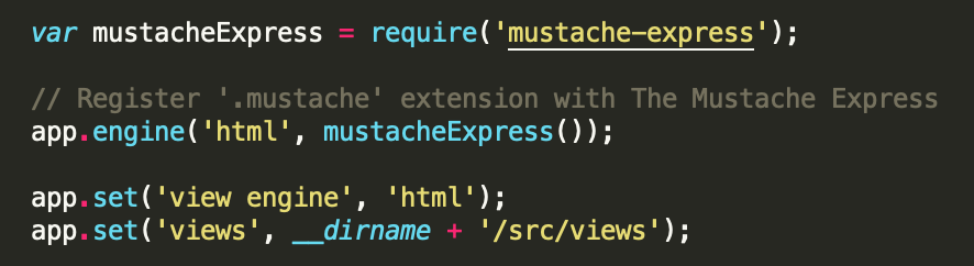
Mustache-Express install:
- with Yarn:
$ yarn add mustache-express - with NPM:
$ npm install mustache --save - configure mustache-express in your server.js/app.js/index.js file:
- create a views folder and add some html view templates (e.g. hello.html):

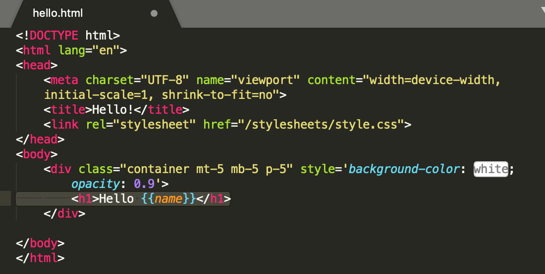
- in the router configuration, res.render(TEMPLATE_NAME, JSON_DATA). Example:
res.render('hello', {"name": "Sherlynn"}) - second parameter would be the JSON data itself.
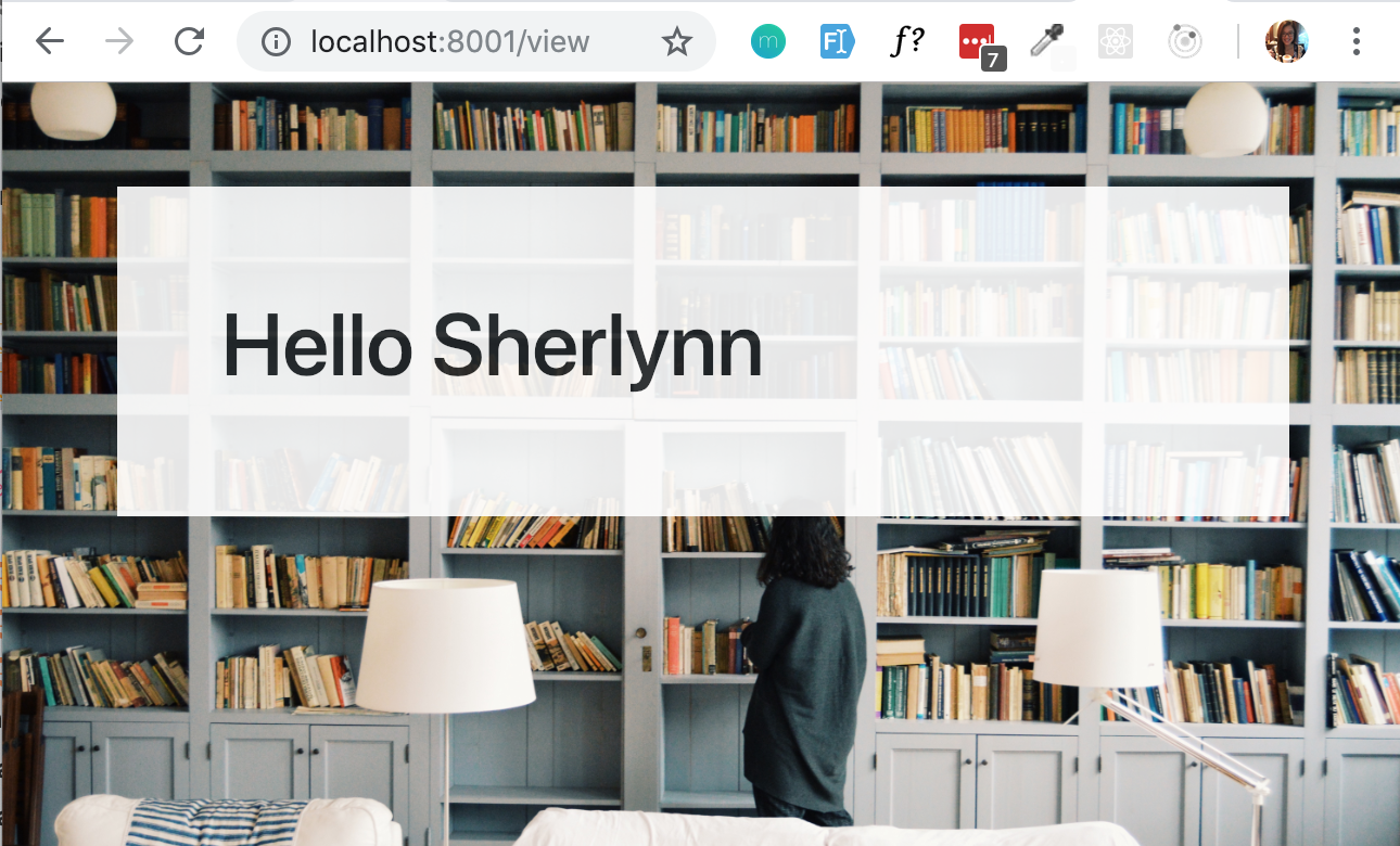
var nameObject = {"name": "Sherlynn"} res.render('hello', nameObject)- Final output:
- with Yarn:
A Complete Guide to Flexbox
-
Properties for the Parent (flex container)
- display. This defines a flex container; inline or block depending on the given value. It enables a flex context for all its direct children.
.container { display: flex; /* or inline-flex */ }- flex-direction. This establishes the main-axis, thus defining the direction flex items are placed in the flex container.
.container {
flex-direction: row | row-reverse | column | column-reverse;
}
Where:
row(default): left to right inltr; right to left inrtlrow-reverse: right to left inltr; left to right inrtlcolumn: same asrowbut top to bottomcolumn-reverse: same asrow-reversebut bottom to top- flex-wrap. By default, flex items will all try to fit onto one line. You can change that and allow the items to wrap as needed with this property.
.container{ flex-wrap: nowrap | wrap | wrap-reverse; }nowrap(default): all flex items will be on one linewrap: flex items will wrap onto multiple lines, from top to bottom.wrap-reverse: flex items will wrap onto multiple lines from bottom to top.
-
flex-flow (Applies to: parent flex container element). This is a shorthand for the
flex-directionandflex-wrapproperties, which together define the flex container’s main and cross axes. The default value isrow nowrap. -
justify-content. It helps distribute extra free space leftover when either all the flex items on a line are inflexible, or are flexible but have reached their maximum size.
.container {
justify-content: flex-start | flex-end | center | space-between | space-around | space-evenly | start | end | left | right ... + safe | unsafe;
}
flex-start (default): items are packed toward the start of the flex-direction.
flex-end: items are packed toward the end of the flex-direction.
start: items are packed toward the start of the writing-mode direction.
end: items are packed toward the end of the writing-mode direction.
left: items are packed toward left edge of the container, unless that doesn’t make sense with the flex-direction, then it behaves like start.
right: items are packed toward right edge of the container, unless that doesn’t make sense with the flex-direction, then it behaves like start.
center: items are centered along the line
space-between: items are evenly distributed in the line; first item is on the start line, last item on the end line
space-around: items are evenly distributed in the line with equal space around them. Note that visually the spaces aren’t equal, since all the items have equal space on both sides. The first item will have one unit of space against the container edge, but two units of space between the next item because that next item has its own spacing that applies.
space-evenly: items are distributed so that the spacing between any two items (and the space to the edges) is equal.
- align-items. This defines the default behavior for how flex items are laid out along the cross axis on the current line.
.container {
align-items: stretch | flex-start | flex-end | center | baseline | first baseline | last baseline | start | end | self-start | self-end + ... safe | unsafe;
}
stretch (default): stretch to fill the container (still respect min-width/max-width)
flex-start / start / self-start: items are placed at the start of the cross axis. The difference between these is subtle, and is about respecting the flex-direction rules or the writing-mode rules.
flex-end / end / self-end: items are placed at the end of the cross axis. The difference again is subtle and is about respecting flex-direction rules vs. writing-mode rules.
center: items are centered in the cross-axis
baseline: items are aligned such as their baselines align
- align-content. This aligns a flex container’s lines within when there is extra space in the cross-axis, similar to how justify-content aligns individual items within the main-axis.
.container {
align-content: flex-start | flex-end | center | space-between | space-around | space-evenly | stretch | start | end | baseline | first baseline | last baseline + ... safe | unsafe;
}
flex-start / start: items packed to the start of the container. The (more supported) flex-start honors the flex-direction while start honors the writing-mode direction.
flex-end / end: items packed to the end of the container. The (more support) flex-end honors the flex-direction while end honors the writing-mode direction.
center: items centered in the container
space-between: items evenly distributed; the first line is at the start of the container while the last one is at the end
space-around: items evenly distributed with equal space around each line
space-evenly: items are evenly distributed with equal space around them
stretch (default): lines stretch to take up the remaining space
-
Properties for the Children (flex items)
- order (controls the order in which they appear in the flex container.)
.item { order: <integer>; /* default is 0 */ }- flex-grow (ability for a flex item to grow if necessary)
.item { flex-grow: <number>; /* default 0 */ }- flex-shrink (the ability for a flex item to shrink if necessary.)
.item { flex-shrink: <number>; /* default 1 */ }- flex-basis (defines the default size of an element before the remaining space is distributed)
.item { flex-basis: <length> | auto; /* default auto */ }-
flex (This is the shorthand for flex-grow, flex-shrink and flex-basis combined.)
-
align-self (allows the default alignment (or the one specified by align-items) to be overridden for individual flex items.)
.item {
align-self: auto | flex-start | flex-end | center | baseline | stretch;
}